女: Women

10:41 PM Unknown 0 Comments


I can’t say I was the most attentive student in APUSH last year, or that I took any extra effort to keep what I learned in that class in my brain, but the general feel of the 1920’s stuck with me – a decade of jubilance, with peace and prosperity and happy, dancing children. And, of course, women. Newly liberated women. They gained the right to vote with the 19th Amendment. They kept the career mobility they found during World War I. They broke out of their traditional female roles, creating the flapper.
The flapper -- girls wilder than any before
The flapper aptly represented the “Roaring Twenties,” seeking pleasure, fun, and risks in the ultimate hedonistic period of America’s history. It was akin to letting a bird out of its cage – the woman in the 1920’s was the image of freedom. Which is why it struck me as odd that Daisy – a supposedly liberated woman who should be enjoying life in the 1920’s – was so obviously trapped.
At a glance, Daisy looks pretty free. She’s affluent due to being married to the “enormously wealthy” (10) Tom Buchanan. But because of his infidelity, the best thing for her would probably be to leave him – and that’s where she’s trapped. She’s unwilling to leave his money and the comfortable life that comes with it, and would rather turn away and try to be “a beautiful little fool” (21).   

Tom and Daisy Buchanan in the 2013 movie adaptation of The Great Gatsby
And I think that says something about the 1920’s as a whole. This hedonism that’s been seen as so-called “freedom” is actually just a vicious cycle of superficial materialism.

0 comments:

歴史: History

8:04 PM Unknown 0 Comments


One stanza into “The History Teacher”, and I had to go back to the top and read it again. It seemed a little bit too ridiculous, that a teacher would need to protect his students from the concept of the Ice Age, and hide it behind a million-year-long sweater weather trend. I mean, people even made four kids’ movies out of it!

Ice Age - a series of popular family films
But as I continued to read along, the wry humor gave me a feeling of ambivalence. On the one hand, I wanted to laugh out loud at the well thought out puns and jokes, but on the other, I understood the heavy undertones of the supposedly lighthearted piece.
It’s quite obvious that Billy Collins is trying to warn against protection against the ugly parts of history, that we need to show children the consequences of them, lest (excuse me for the cliché) history repeats itself. He shows it as some sort of a communication disconnect – the history “teacher” is in class, thinking he’s doing the world a service by protecting these children’s innocence, but the children then turn around and act out less extreme versions of what they didn’t learn about on the playground, against “the weak and the smart.” And while the children do this, thinking all is right with the world, because they were never taught that all is not right, the history teacher turns his back and congratulates himself on a job well done, utterly oblivious to the damage he has done.

It’s quite the vicious cycle. On the one hand, they claim that we are “too young” to know about certain things, yet on the other, they stress the need to pass down accurate history in order to prevent more disasters (such as a World War III). And then they blame all the problems on the world on the younger generation. But they forget – who was it who covered our eyes as they had us roam the world? It’s no wonder we bumped into a few poles.

Anna - you're too cruel to us.

0 comments:

絵: Painting

12:37 PM Unknown 1 Comments


Last Wednesday, Mrs. Tuma told us about some new part of the Troy curriculum, in which all subjects needed to incorporate writing… or something like that. To be honest, once we learned that we would need to write in art, we all basically plugged our ears and refused to listen any longer. Writing should stay in the English classroom, we thought. The next day, we talked about art in English.
The subject of my first-sixth hour switch was Officer of the Hussars, a painting by African-American artist Kehinde Wiley, which Ms. Valentino had seen at an exhibition at the Detroit Institute of Arts, and had claimed to be “very provoking.” We proceeded to spend the next hour attempting to provoke some discussion from the painting. Needless to say, just like writing in art, analyzing the visual rhetoric of the painting was a bit awkward (it wasn’t quite like Maus – that was still considered literature. This was a different art form altogether).

Officer of the Hussars - Kehinde Wiley (2007)
We were allowed to use our phones to search up the painting in order to see it in more detail. When I googled Officer of the Hussars, however, the first thing that showed up wasn’t the photorealistic painting of an African man on a horse. It was this.
Officer of the Hussars - Theodore Gericault (1812)
It’s realistic, I guess. But not entirely. It’s 19th century realistic; the shadows don’t dig quite as deep, the details aren’t as articulated, the textures aren’t as naturally random as in real life. But Wiley’s painting (my artist self quivers in awe at the photorealistic-ness of it) – that’s skill. There’s just the perfect contrast between the lights and the darks, the right amount of detail in his veins, and the normal irregularity in the folds of his clothes. It seems to me as if Wiley cut out a picture and pasted it over the former Officer of the Hussars.
 Wiley borrows a large part of the original painting so people can identify that he’s fighting a war. But the two Officers of the Hussars are fighting different wars. Wiley's war is definitely more realistic, more concrete. There’s a larger contrast – a more distinct rift between the two sides of racism. There’s more detail – more intricacies resulting from the hundreds of years this conflict has existed for. There’s more irregularity – more confusion as to the reason of the conflict. It seems pointless, this hatred of skin color, but the war between acceptance and rejection exists nonetheless.

1 comments:

他: Other

6:38 PM Unknown 1 Comments


According to Price in “The Plastic Pink Flamingo: A Natural History”, one half of the flamingo’s success is due to its bright pink hue. She lists a plethora of “electrochemical pastels” (line 33) of the 50’s in lines 34 to 36. As an artist, I could tell you exactly what kind of dingy olive green you would get from mixing cadmium yellow and ultramarine blue, but I am ashamed to admit that I couldn’t imagine half of the colors Price references (I blame the generation gap). So I need to get my act together and figure these colors out.

The lawn flamingo. It's only two defining qualities: it's pink, and it's a flamingo.

Tangerine: This is one I know, and I think everyone will know. The color of the citrus fruit that is so amazingly soothing to consume if you have a sore throat. Also, kind of reddish. Like a dark coral?
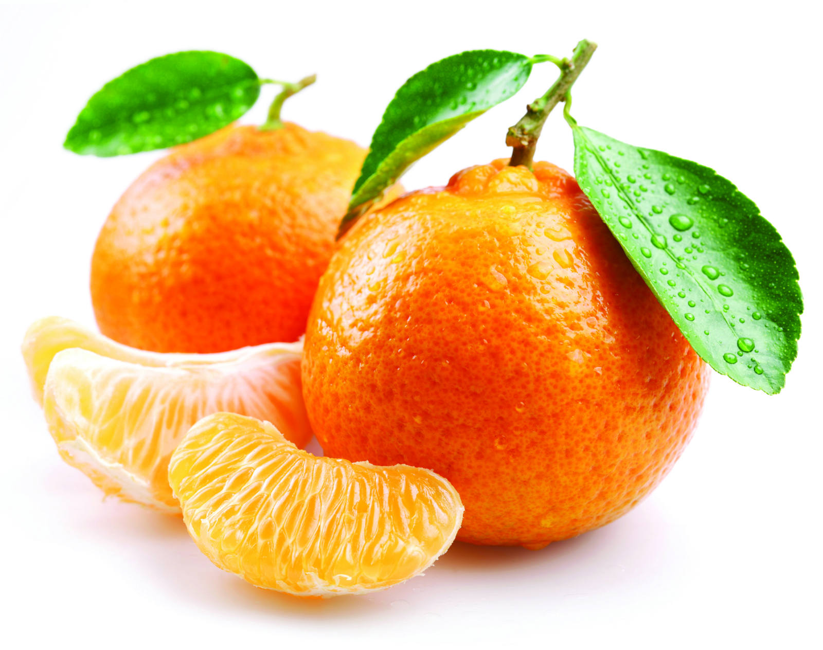
The rather photogenic tangerine -- but you get the idea.
Broiling magenta: Ah, magenta. The consensus color people default to when they get tired of debating whether Sarah’s shirt is pink or purple – we all know magenta. But broiling magenta? It sounds like a color used on a hot summer day. My verdict: a darker magenta. Like the pink/purple version of maroon. Doesn’t sound particularly “pastel”-y (line 33) to me.
Livid pink: Livid reminds me of that one crazy aunt everybody has, the one who finds faults in everything and is convinced the world is ending – and angry, always angry. Interestingly, this word that’s used to describe pink has a dictionary definition of “a dark purplish color” (Merriam-Webster). A dark mixture of purple and pink… isn’t this just broiling magenta?
Incarnadine: This one loses me. A quick Google search shows me… a dark pinkish-red. I don’t know, I kind of imagined “forward-looking” colors to be brighter, but they’re all pretty dark. But no matter. Moving on.

A room designed with an incarnadine theme.
Fuchsia demure: Fuchsia, I know, is a pink. A fuchsia, I also know, is a redish, pinkish flower. And demure means modest and ladylike (which I didn’t know but the dictionary told me). I thought these hues weren’t “old-fashioned” (line 37)?
Congo ruby: Ruby is a dark blood-red jewel. I’ll just end it here.

Rubies: The birthstone of those born in July.
Methyl green: Wow, a cold color in this lengthy list of warm pinks! And what a cold color indeed – methyl reminds me of my AP chemistry days, which could be considered the dark ages of my life thus far. Also, apparently methyl green is the name of an actual chemical compound. I must have forgotten that. In any case, Google Images shows me that this is the only remotely “pastel” color in the list.

Methyl green, presumably under a microscope.
Having done that research, I now feel slightly deceived. These mostly dark colors are, by any stretch of the imagination, not “electrochemical pastels,” “forward-looking,” or “sassy” (line 40). With an initial reading of the essay, I had the notion that America was obsessed with bright, joyful colors. I do have to commend Price for her artful manipulation of these colors – it just further proves her point that American consumerism was (and is) absolutely ridiculous.
I know of a friend who might be rejoicing after reading this post – maroon is her favorite color. I, however, am partial to brighter colors, and am now suffering from a saturation deficit. I’ll need to go find an essay about consumerism in the 70’s.  

1 comments:

バービー: Barbie

11:28 AM Unknown 6 Comments


Let me just say that I don’t get this whole Barbie controversy. Like, really, Barbie’s a doll. Dolls don’t need to be proportionate. The creation of dolls is an art, too, and artists should be able to have creative freedom with whatever they want to create. If the artists of Mattel wanted to create a super attractive yet unattainable body for Barbie, then so be it. It shouldn’t matter – she’s a doll!

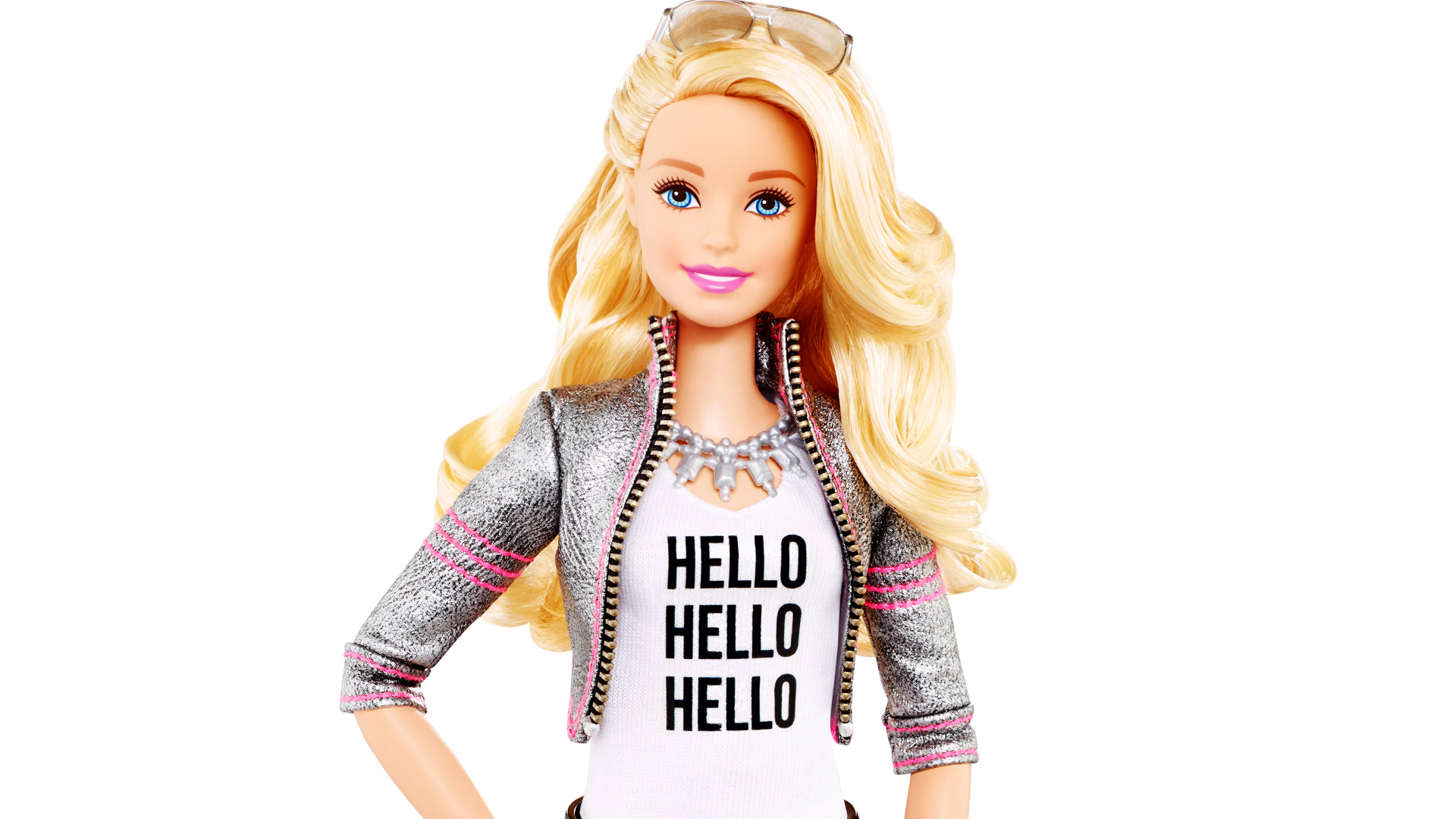
Barbie has become a familiar image in mainstream society.
 Most of Emily Prager’s arguments in “Our Barbies, Ourselves” are just too extreme, in my opinion. All of Barbie’s supposed faults are just due to the fact that she’s a doll made for little girls to play with. Her discussion about Ken, especially, struck me as odd. “He had no genitals, and, even at age ten, I found that ominous” (Prager). I find two problems with this statement. One, why was Prager aware of and concerned about male genitals at the age of ten? And two, neither does Barbie. And there’s a reason for that. Barbie and company are marketed towards children, who really have no need to know about all that. Ten-year-old Prager’s obvious distraught over how “[Barbie] would never turn Ken on” (Prager) was just, quite frankly, disturbing.
But of course, the controversy’s there, and along with it comes a slew of anti-Barbie products, one of which is Lammily, who’s based on the body proportions of an average American 19-year-old. The best thing about her? She comes with stick-on acne and cellulite. How wonderful.

Nickolay Lamm's proportioniate Lammily doll. What a creative name.
 Jokes and sarcasm aside, this Barbie controversy has brought out the opposite extreme as well. It’s a novel idea to create a proportionate doll, but was it really necessary to bring the bodily functions into the picture, too?

Lammily's acne is the very epitome of natural beauty.
 Humans just have the tendency to pick out problems where there are none, just because they’re bored. The world would be a very different place without all the flame wars on the Internet, screaming politicians on TV, and passive-aggressive articles, such as those of Prager. It keeps the world interesting, I guess. Complain-y, but interesting. 

Fun fact: I'm still a huge fan of Barbie movies. I actually think they're great. No judgement.

6 comments:

Powered by Blogger.